MixOmics: a “swiss army knife” for -omics integration

Introduction

Genomics is the study of an organism’s complete set of genetic material, including its DNA sequence, genes, and regulation of gene expression. Other “omics” techniques, such as proteomics and metabolomics, focus on the study of proteins and metabolites, respectively. By analyzing these different types of data together, researchers can generate new insights into the inner workings of an organism and how it responds to its environment.

For example, by combining genomics data with proteomics and metabolomics data, researchers can gain a more complete understanding of an organism’s gene expression, protein production, and metabolic processes, and how these processes work together to create health, or dysfunction to create disease. This knowledge can provide valuable insights for a wide range of applications, including drug development, disease diagnosis, and environmental monitoring.

Finding correlations between related datasets means looking for patterns or relationships between different sets of data. This can provide valuable insights into the underlying biological processes and functions of an organism. For example, if two datasets show a strong positive correlation, it suggests that they are related in some way and that changes in one dataset may be associated with changes in the other. By identifying these correlations, researchers can better understand the mechanisms behind biological processes and how they are regulated. This can be useful for a variety of applications, such as predicting the effects of potential drugs or identifying potential targets for medical intervention.

I have surveyed the literature for tools to integrate multiple -omics datasets together. As is the case for any task in bioinformatics, there are dozens of options. However, when I considered criteria such as ease of installation, documentation quality, robust user community, user support and published analyses, I believe that the “mixOmics” package (available for download and installation from Bioconductor) is one of the best tools out there for doing this type of integration analysis.

The mixOmics approach

The mixOmics package encompasses many different versions of multivariate algorithms for integrating multiple datasets. Multivariate analysis is well-suited to this problem space where there are far more features than samples. By reducing the dimension of the data, the analysis makes it easier for a human analyst to see patterns and interpret correlations. One of the most common types of algorithm in mixOmics for doing this is called “partial least squares.”

Fig 1. An overview of the mixOmics package. The methods can handle single ‘omics, multiple ‘omics on the same samples (N-integration), and the same ‘omics on multiple sets of samples (P-integration) to find correlations in the data. Some examples of the graphic outputs are shown in the bottom two panels of the figure.

The partial least squares (PLS) method is a mathematical technique used to analyze relationships between two or more datasets. It works by identifying the underlying patterns and correlations in the data, and then using this information to construct a set of “composite” variables that capture the most important features of the data (this is analogous to PCA analysis, but differs by focusing on maximizing correlation/covariance among latent variables).

These composite (latent) variables can then be used to make predictions or draw conclusions about the relationships between the datasets. For example, if two datasets are known to be related in some way, the PLS method can be used to identify the specific features of each dataset that are most strongly correlated with the other, and then construct composite variables based on these features. PLS is more robust than PCA to highly correlated features and can be used to make predictions between the dependent and independent variables.

mixOmics takes the PLS method a step further by integrating a ‘feature-selection’ option called “sparse PLS” or just “sPLS” that uses “lasso” penalization to reduce unnecessary features from the final model to aid interpretation and also computational time. Lasso regression works by adding a regularization term to the ordinary least squares regression model, which is a measure of the complexity of the model. This regularization term, called the “lasso,” forces the coefficients of the model to be zero for the less important predictors, effectively eliminating them from the model.

This results in a simpler and more interpretable model that is better able to make accurate predictions. Lasso regression is particularly useful for datasets with a large number of predictors, as it can help to identify the most important predictors and reduce the risk of overfitting the model.

Conclusion

In future posts, I will describe in more detail what can be done with MixOmics and show some results from our own studies that have produced stunningly detailed and intricate correlation networks. If you are interested in this kind of work, I would encourage you to check out mixOmics as a possible avenue for analysis. There are other packages, and many of them are excellent, but the learning curve of mixOmics is quite shallow and it is well supported with a dynamic and active user community. It is also very flexible to different experimental scenarios, so that you can analyze your data several different ways while using the same package and R script.

Create a volcano plot on EBSeq output

The differential expression analysis program EBSeq produces a number of data objects as part of the workflow, but there aren’t many options for visualization of the data.

The authors suggest the use of heatmap.2 in R:

heatmap.2(NormalizedMatrix[GenesOfInterest,], scale=”row”, trace=”none”, Colv=F)

However, this depends on knowing ahead of time your genes of interest.  It is not practical to generate a heatmap with hundreds or thousands of DE genes.

I wanted to produce something approximating a volcano plot for EBSeq results.  What I came up with initially was the following:

A pseudo-volcano plot for EBSeq results.  The y-axis is posterior probability of differential expression (PPDE).
A pseudo-volcano plot for EBSeq results. The y-axis is posterior probability of differential expression (PPDE).

To make this plot, I had to grab some data arrays from the large object “EBOut” that is produced by calling the “EBTest” method and from the “GeneFC” object as below:

plot(GeneFC$PostFC, EBOut$PPDE, 
xlim =c(0,5), ylim=c(0,1), 
main="Control/Experimental FC vs. PPDE",
sub=GeneFC$Direction, xlab="EBSeq Posterior Fold Change", ylab="EBSeq posterior prob of DE")

abline(h=0.95)

The “abline” command places a horizontal line where the PPDE is equal to or greater than 95%.  This would be equivalent to an FDR of 0.05.

If you want to inspect the plot interactively in R to identify gene names above the threshold and/or with large posterior fold changes you would use:

identify(GeneFC$PostFC, EBOut$PPDE, labels=names(GeneFC$PostFC))

To make it look more like a canonical volcano plot, I then tried:

plot(log2(GeneFC$RealFC), EBOut$PPDE, 
xlim =c(-5,5), 
ylim=c(0,1), 
main="Log2FoldChange vs. PPDE", 
xlab="EBSeq Log2 Fold Change", ylab="EBSeq PPDE")

Creating the following plot:

Fig 2.  Log(2) Fold Change on the X-axis.
Fig 2. Log(2) Fold Change on the X-axis.

This is good, except I want to subset the data and add colors. To do this I need to create a new dataframe from the EBOut$PPDE and GeneFC$PostFC objects:

volc_df = data.frame(EBOut$PPDE, GeneFC$PostFC)

With everything in one dataframe, plotting and subsetting the data is easier. Inspired by this post at Stephen Turner’s “Getting Genetics Done” blog, I prepared my final colored volcano plot as follows:

with(volc_df, plot(log2(PostFC), PPDE, pch=20, main="Volcano Plot EBSeq", xlim=c(-5,5)))

abline(h=0.95)

with(subset(volc_df, PPDE > 0.95 & abs(log2(PostFC)) < 2), points(log2(PostFC), PPDE, pch=20, col="orange")) 

with(subset(volc_df, PPDE > 0.95 & abs(log2(PostFC)) < 2), points(log2(PostFC), PPDE, pch=20, col="red"))

The final plot looks like this:

Fig 3.  The final plot, with colored points for the DE genes, and higher fold change indicated with red.
Fig 3. The final plot, with colored points for the DE genes, and higher fold change indicated with red.

What is tidy data?

tidy data
A warehouse of tidy data (in paper form).

What is “tidy” data?

What is meant by the term “tidy” data, as opposed to “messy” data?  In my last post I listed five of the most common problems encountered with messy datasets.  Logically, “tidy” data must not have any of these problems.  So just what does tidy data look like?

Let’s take a look at an example of tidy data.  Below are the first 20 lines from R’s built-in “airquality” dataset:

Fig 1.  Air quality dataset is messy data.
Figure 1. The “airquality” dataset.

According to R programmer and professor of statistics Hadley Wickham, tidy data can be defined as the following:

1)  Each variable forms a column

2) Each observation forms a row

3) Each type of observational unit forms a table

That’s it.  “Airquality” is tidy because each row corresponds to one month/day combination and the four measured weather variables (ozone, solar, wind, and temp) on that day.

What about messy data?

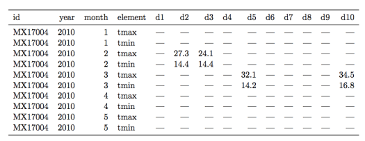
Let’s see an example of a messy weather dataset for a counterexample (data examples are from this paper by H. Wickham):

Figure 2.  A messy weather dataset.  Not all columns are shown for the sake of clarity.
Figure 2. A messy weather station dataset.  Not all columns are shown for the sake of clarity.

There are multiple “messy” data problems with this table.  First, identifying variables like day of the month are stored in column headers (“d1”, “d2”, etc…), not in rows.  Second, there are a lot of missing values, complicating analysis and making it harder to read the table.  Third, the column “element” consists of variable names (“tmin” and “tmax”) violating rule 1 of tidy data.

How to use R tools to transform this table into tidy form is beyond the scope of this post, so I will just show the tidy version of this dataset in Figure 3.

Screen shot 2014-08-01 at 1.55.23 PM
Figure 3. The weather station data in tidy form.

Each column now forms a unique variable.  The date information has been condensed into a more compact form and each row contains the measurements for only one day.  The two variables in the “element” column are now forming their own columns, “tmax” and “tmin.”  With the data in this form it is far easier to prepare plots, aggregate the data, and perform statistical analysis.


Five Common Problems with Messy Data

6957593947_75f7aaecd0_zReal world datasets are often quite messy and not well-organized for available data analysis tools.  The data scientist’s job often begins with whipping these messy datasets into shape for analysis.

Listed below are five of the most common problems with messy datasets, according to an excellent paper on “tidy data” by Hadley Wickham:

1) Column headers are variables, not variable names

Tabular data falls into this type, where columns are variables themselves.  For example,  a table with median income by percentile in columns and US states in rows. 

2) Multiple variables are stored in one column

An example here would be storing data in columns that combine two variables, like gender and age range.  Better to make two separate columns for gender and age range.

3) Variables are stored in both rows and columns

The most complex form of messy data.   For example, a dataset in which measurements from a weather station are stored according to date and time, with the various measurment types (temp, pressure, etc…) in a column called “measurements”.  

4) Multiple types of observational units are stored in the same table

A dataset that combines multiple unrelated observations or facts into one table.   For example, a clinical trial dataset that includes both treatment outcomes and diet choices into one large table by patient and date. 

5) A single observational unit stored in multiple tables

Measurements recorded in different tables split up by person, location, or time.  For example, a separate table of an individual’s medical history for each year of their life. 

Using R to automate ROC analysis

ROC analysis is used in many types of research.  I use it to examine the ability of molecular docking to enrich a list of poses for experimental hits.  This is a pretty standard way to compare the effectiveness of docking methodologies and make adjustments in computational parameters.

An example ROC plot on a randomly generated dataset
An example ROC plot on randomized data

Normally this kind of plot would take at least an hour to make by hand in Excel, so I wrote a function in R that generates a publication-quality ROC plot on the fly.  This is handy if you want to play around with the hit threshold of the data (i.e., the binding affinity) or experiment with different scoring functions.

According to wikipedia:

a receiver operating characteristic (ROC), or simply ROC curve, is a graphical plot which illustrates the performance of a binary classifier system as its discrimination threshold is varied. It is created by plotting the fraction of true positives out of the total actual positives (TPR = true positive rate) vs. the fraction of false positives out of the total actual negatives (FPR = false positive rate), at various threshold settings.

There are already several ROC plot calculators on the web.  But I wanted to write my own using the R statistical language owing to its ability to produce very high-quality, clean graphics.  You can find the code here:

https://github.com/mchimenti/data-science-coursera/blob/master/roc_plot_gen.R

The function takes a simple 2 column input in csv format.   One column is “score,” the other is “hit” (1 or 0).   In the context of docking analysis, “score” is the docking score and hit is whether or not the molecule was an experimental binder.   The area-under-curve is calculated using the “trapz” function from the “pracma” (practical mathematics) package.