What is tidy data?

tidy data
A warehouse of tidy data (in paper form).

What is “tidy” data?

What is meant by the term “tidy” data, as opposed to “messy” data?  In my last post I listed five of the most common problems encountered with messy datasets.  Logically, “tidy” data must not have any of these problems.  So just what does tidy data look like?

Let’s take a look at an example of tidy data.  Below are the first 20 lines from R’s built-in “airquality” dataset:

Fig 1.  Air quality dataset is messy data.
Figure 1. The “airquality” dataset.

According to R programmer and professor of statistics Hadley Wickham, tidy data can be defined as the following:

1)  Each variable forms a column

2) Each observation forms a row

3) Each type of observational unit forms a table

That’s it.  “Airquality” is tidy because each row corresponds to one month/day combination and the four measured weather variables (ozone, solar, wind, and temp) on that day.

What about messy data?

Let’s see an example of a messy weather dataset for a counterexample (data examples are from this paper by H. Wickham):
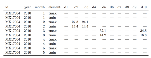
Figure 2.  A messy weather dataset.  Not all columns are shown for the sake of clarity.
Figure 2. A messy weather station dataset.  Not all columns are shown for the sake of clarity.

There are multiple “messy” data problems with this table.  First, identifying variables like day of the month are stored in column headers (“d1”, “d2”, etc…), not in rows.  Second, there are a lot of missing values, complicating analysis and making it harder to read the table.  Third, the column “element” consists of variable names (“tmin” and “tmax”) violating rule 1 of tidy data.

How to use R tools to transform this table into tidy form is beyond the scope of this post, so I will just show the tidy version of this dataset in Figure 3.

Screen shot 2014-08-01 at 1.55.23 PM
Figure 3. The weather station data in tidy form.

Each column now forms a unique variable.  The date information has been condensed into a more compact form and each row contains the measurements for only one day.  The two variables in the “element” column are now forming their own columns, “tmax” and “tmin.”  With the data in this form it is far easier to prepare plots, aggregate the data, and perform statistical analysis.


Five Common Problems with Messy Data

6957593947_75f7aaecd0_zReal world datasets are often quite messy and not well-organized for available data analysis tools.  The data scientist’s job often begins with whipping these messy datasets into shape for analysis.

Listed below are five of the most common problems with messy datasets, according to an excellent paper on “tidy data” by Hadley Wickham:

1) Column headers are variables, not variable names

Tabular data falls into this type, where columns are variables themselves.  For example,  a table with median income by percentile in columns and US states in rows. 

2) Multiple variables are stored in one column

An example here would be storing data in columns that combine two variables, like gender and age range.  Better to make two separate columns for gender and age range.

3) Variables are stored in both rows and columns

The most complex form of messy data.   For example, a dataset in which measurements from a weather station are stored according to date and time, with the various measurment types (temp, pressure, etc…) in a column called “measurements”.  

4) Multiple types of observational units are stored in the same table

A dataset that combines multiple unrelated observations or facts into one table.   For example, a clinical trial dataset that includes both treatment outcomes and diet choices into one large table by patient and date. 

5) A single observational unit stored in multiple tables

Measurements recorded in different tables split up by person, location, or time.  For example, a separate table of an individual’s medical history for each year of their life. 

Using R to automate ROC analysis

ROC analysis is used in many types of research.  I use it to examine the ability of molecular docking to enrich a list of poses for experimental hits.  This is a pretty standard way to compare the effectiveness of docking methodologies and make adjustments in computational parameters.

An example ROC plot on a randomly generated dataset
An example ROC plot on randomized data

Normally this kind of plot would take at least an hour to make by hand in Excel, so I wrote a function in R that generates a publication-quality ROC plot on the fly.  This is handy if you want to play around with the hit threshold of the data (i.e., the binding affinity) or experiment with different scoring functions.

According to wikipedia:

a receiver operating characteristic (ROC), or simply ROC curve, is a graphical plot which illustrates the performance of a binary classifier system as its discrimination threshold is varied. It is created by plotting the fraction of true positives out of the total actual positives (TPR = true positive rate) vs. the fraction of false positives out of the total actual negatives (FPR = false positive rate), at various threshold settings.

There are already several ROC plot calculators on the web.  But I wanted to write my own using the R statistical language owing to its ability to produce very high-quality, clean graphics.  You can find the code here:

https://github.com/mchimenti/data-science-coursera/blob/master/roc_plot_gen.R

The function takes a simple 2 column input in csv format.   One column is “score,” the other is “hit” (1 or 0).   In the context of docking analysis, “score” is the docking score and hit is whether or not the molecule was an experimental binder.   The area-under-curve is calculated using the “trapz” function from the “pracma” (practical mathematics) package.