Importing a merged Seurat dataset into Monocle

I recently ran across a situation that I think is going to be increasingly common as I do more and more single-cell analyses.   Specifically, I had a project where the investigator had several experiments in related conditions that they want to merge and evaluate with a pseudotime analysis.   I could not find any useful tools within Monocle itself for merging data (please correct me in the comments if I’m missing something).   It looks as if you have to import a pre-merged seurat dataset.

Here is the workaround that I found [please note these commands are for Seurat v2, they will likely *not* work in v3]:

naive.data <- Read10X(data.dir = paste0(base_dir, "naive_outs/filtered_gene_bc_matrices/mm10/"))
naive <- CreateSeuratObject(raw.data = naive.data, min.cells = 3, min.genes = 200, project = "10X_naive")

lcmv.data <- Read10X(data.dir = paste0(base_dir, "lcmv_outs/filtered_gene_bc_matrices/mm10/"))
lcmv <- CreateSeuratObject(raw.data = lcmv.data, min.cells = 3, min.genes = 200, project = "10X_lcmv")

pygp.data <- Read10X(data.dir = paste0(base_dir, "pygp_outs/filtered_gene_bc_matrices/mm10/"))
pygp <- CreateSeuratObject(raw.data = pygp.data, min.cells = 3, min.genes = 200, project = "10X_pygp")

cd4.combined <- MergeSeurat(object1 = naive, object2 = lcmv, add.cell.id1 = "naive", add.cell.id2 = "lcmv")
cd4.combined <- AddSamples(object = cd4.combined, new.data = pygp.data, add.cell.id = "pygp")

cd4.combined@raw.data <- as.matrix(cd4.combined@raw.data)
cd4.monocle <- importCDS(cd4.combined, import_all = TRUE)

Here, I am reading in 10X data using Seurat (v2) w/ the Read10X function and then creating the Seurat object with CreateSeuratObject.

Once this done I use MergeSeurat to merge the first two experiments, and then AddSamples to add in the final experiment.   Then we can take advantage of the monocle function importCDS to import the combined object into monocle.

Now there is one final problem and that is that the “orig.ident” field is blank:


To recover the original identity of each cell, we can use the updated cell names from the merged Seurat dataset (i.e., “naive_AAACTGAGAAACCGA”).   We just need to split these and recover which experiment each cell came from with:

cellnames <- rownames(pData(cd4.monocle))
orig_ident <- sapply(strsplit(cellnames, split = "_"), '[', 1)
pData(cd4.monocle)$orig.ident <- orig_ident

We do a strsplit on the cellnames, splitting on underscore. The first value from the split in each case is assigned back into the ‘orig.ident’ field of the cell dataset object.

Now you’re ready to continue with the normal downstream analysis in monocle.  With dimensionality reduction and clustering done (not shown), we can plot the calculated clusters side-by-side with the experiment of origin (from the merged seurat dataset):

library(cowplot)
p1 <- plot_cell_clusters(cd4.monocle, color_by = 'orig.ident')
p2 <- plot_cell_clusters(cd4.monocle) #color_by cluster is default behavior
plot_grid(p1,p2)

And we get:

The PCA clusters on the tSNE plot (left) and orig.ident values on the tSNE plot (right). I have edited out the identities of the clusters on the right. This is unpublished data, I am using it here for educational purposes only. Please do not reproduce or copy this image.


Developers versus consumers of bioinformatics analysis tools

Life in the middle

As a bioinformatics applications scientist, I work in a middle ground between those who develop code for analyzing next-gen sequencing data and those who consume that analysis.   The developers are often people trained in computer science, mathematics, and statistics.   The consumers are often people trained in biology and medicine.    There is some overlap, of course, but if you’ll allow a broad generalization, I think the two groups (developers and consumers) are separated by large cultural differences in science.

Ensemble focus vs. single-gene focus

I think one of the biggest differences from my experience is the approach to conceptualizing the results of a next-gen seq experiment (e.g., RNA-seq).    People on the methods side tend to think in terms of ensembles and distributions.   They are interested in how the variation observed across all 30,000 genes can be modeled and used to estimate differential expression.   They are interested in concepts like shrinkage estimators, bayesian priors, and hypothesis weighting.  The table of differentially expressed features is thought to have meaning mainly in the statistical analysis of pathway enrichment (another ensemble).

Conversely, biologists have a drastically different view.   Often they care about a single gene or a handful of genes and how those genes vary across conditions of interest in the system that they are studying.  This is a rational response to the complexity of biological systems; no one can keep the workings of hundreds of genes in mind.  In order to make progress, you must focus.  However, this narrow focus leads investigators to sometimes cherry pick results pertaining to their ‘pet’ genes.  This can invest those results with more meaning than is warranted from a single experiment.

The gene-focus of biologists also leads to clashes with the ensemble-focus of bioinformatics software.  For example, major DE analysis packages like DESeq2 do not have convenience functions to make volcano plots, even though I’ve found that those kinds of plots are the most useful and easiest to understand for biologists.   Sleuth does have a volcano plotting function, but doesn’t allow for labeling genes.  In my experience, however, biologists want a high-res figure with common name gene labels (not ensemble transcript IDs) that they can circle and consider for wet lab validation.

New software to address the divide?

I am hopeful about the recent release of the new “bcbioRNASeq” package from Harvard Chan school bioinformatics (developers of ‘bcbio’ RNA-seq pipeline software).   It appears to be a step towards making it easier for people like me to walk on both sides of this cultural divide.    The package takes all of the outputs of the ‘bcbio’ pipeline and transforms them into an accessible S4 object that can be operated on quickly and simply within R.

Most importantly, the ‘bcbioRNASeq’ module allows for improved graphics and plotting that make communication with biologists easier.  For example, the new MA and volcano plots appear to be based on ‘ggplot2’ graphics and are quite pretty (and have text label options(!), not shown here):

I still need to become familiar with the ‘bcbioRNASeq’ package, but it looks quite promising.   ‘pcaExplorer‘ is another R/Bioconductor package that I feel does a great job of making accessible RNA-seq reports quickly and easy.  I suspect we will see continued improvements to make plots prettier and more informative, with an increasing emphasis on interactive, online plots and notebooks rather than static images.

Beyond Benjamini-Hochberg: Independent Hypothesis Weighting (IHW) for multiple test correction

Multiple hypothesis testing is a critical part of modern bioinformatic analysis.  When testing for significant changes between conditions on many thousands of genes, for instance in an RNA-Seq experiment, the goal is maximize the number of discoveries while controlling the false discoveries.

Typically, this is done by using the Benjamini-Hochberg (BH) procedure, which aims to adjust p-values so that no more than a set fraction (usually 5%) of discoveries are false positives (FDR = 0.05). The BH method is better powered and less stringent than the more strict family-wise error rate (FWER) control, and therefore more appropriate to modern genomics experiments that make thousands of simultaneous comparisons.  However, the BH method is still limited by the fact that it uses only p-values to control the FDR, while treating each test as equally powered.

A new method, Independent Hypothesis Weighting (IHW), aims to take advantage of the fact that individual tests may differ in their statistical properties, such as sample size, true effect size, signal-to-noise ratio, or prior probability of being false.  For example, in an RNA-Seq experiment, highly-expressed genes may have better signal-to-noise than low-expressed genes.

The IHW method applies weights (a non-negative number between zero and one) to each test in a data-driven way.  The input to the method is a vector of p-values (just like BH/FDR) and a vector of continuous or categorical covariates (i.e., any data about each test that is assumed to be independent of the test p-value under the null hypothesis).

From the paper linked above, Table 1 lists possible covariates:

Application Covariate

Differential expression analysis Sum of read counts per gene across all samples [12]
Genome-wide association study (GWAS) Minor allele frequency
Expression-QTL analysis Distance between the genetic variant and genomic location of the phenotype
ChIP-QTL analysis Comembership in a topologically associated domain [16]
t-test Overall variance [9]
Two-sided tests Sign of the effect
Various applications Signal quality, sample size

In simplified form, the IHW method takes the tests and groups them based on the supplied covariate.  It then calculates the number of discoveries (rejections of the null hypothesis) using a set of weights. The weights are iterated until the method converges on the optimal weights for each covariate-based group that maximize the overall discoveries.  Additional procedures are employed to prevent over-fitting of the data and to make the procedure scale easily to millions of comparisons.

The authors of the method claim that IHW is better powered than BH for making empirical discoveries when working with genomic data.  It can be accessed from within Bioconductor.


What is tidy data?

tidy data
A warehouse of tidy data (in paper form).

What is “tidy” data?

What is meant by the term “tidy” data, as opposed to “messy” data?  In my last post I listed five of the most common problems encountered with messy datasets.  Logically, “tidy” data must not have any of these problems.  So just what does tidy data look like?

Let’s take a look at an example of tidy data.  Below are the first 20 lines from R’s built-in “airquality” dataset:

Fig 1.  Air quality dataset is messy data.
Figure 1. The “airquality” dataset.

According to R programmer and professor of statistics Hadley Wickham, tidy data can be defined as the following:

1)  Each variable forms a column

2) Each observation forms a row

3) Each type of observational unit forms a table

That’s it.  “Airquality” is tidy because each row corresponds to one month/day combination and the four measured weather variables (ozone, solar, wind, and temp) on that day.

What about messy data?

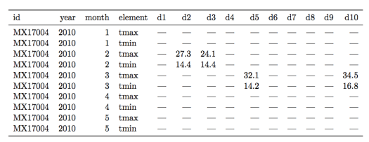
Let’s see an example of a messy weather dataset for a counterexample (data examples are from this paper by H. Wickham):

Figure 2.  A messy weather dataset.  Not all columns are shown for the sake of clarity.
Figure 2. A messy weather station dataset.  Not all columns are shown for the sake of clarity.

There are multiple “messy” data problems with this table.  First, identifying variables like day of the month are stored in column headers (“d1”, “d2”, etc…), not in rows.  Second, there are a lot of missing values, complicating analysis and making it harder to read the table.  Third, the column “element” consists of variable names (“tmin” and “tmax”) violating rule 1 of tidy data.

How to use R tools to transform this table into tidy form is beyond the scope of this post, so I will just show the tidy version of this dataset in Figure 3.

Screen shot 2014-08-01 at 1.55.23 PM
Figure 3. The weather station data in tidy form.

Each column now forms a unique variable.  The date information has been condensed into a more compact form and each row contains the measurements for only one day.  The two variables in the “element” column are now forming their own columns, “tmax” and “tmin.”  With the data in this form it is far easier to prepare plots, aggregate the data, and perform statistical analysis.


Five Common Problems with Messy Data

6957593947_75f7aaecd0_zReal world datasets are often quite messy and not well-organized for available data analysis tools.  The data scientist’s job often begins with whipping these messy datasets into shape for analysis.

Listed below are five of the most common problems with messy datasets, according to an excellent paper on “tidy data” by Hadley Wickham:

1) Column headers are variables, not variable names

Tabular data falls into this type, where columns are variables themselves.  For example,  a table with median income by percentile in columns and US states in rows. 

2) Multiple variables are stored in one column

An example here would be storing data in columns that combine two variables, like gender and age range.  Better to make two separate columns for gender and age range.

3) Variables are stored in both rows and columns

The most complex form of messy data.   For example, a dataset in which measurements from a weather station are stored according to date and time, with the various measurment types (temp, pressure, etc…) in a column called “measurements”.  

4) Multiple types of observational units are stored in the same table

A dataset that combines multiple unrelated observations or facts into one table.   For example, a clinical trial dataset that includes both treatment outcomes and diet choices into one large table by patient and date. 

5) A single observational unit stored in multiple tables

Measurements recorded in different tables split up by person, location, or time.  For example, a separate table of an individual’s medical history for each year of their life.