Five cool features in PyMOL (that you may have missed)

Here are some lesser-known PyMOL tricks that let you do some pretty cool (and useful) things:

1.  Display B-factors

If you want to see the “b-factor putty” view where the backbone is displayed as a tube with a diameter correlated to the b-factor of the structure, simply click the Action button of the object (the “A” button); mouse to “preset”; and select “b-factor putty.”  The structure will automatically convert to a colored putty view suitable for slide figures or publications.

Create B-factor putty in PyMOL.

2.  Poisson-Boltzmann electrostatics

Want to get a sense for the patches of positive and negative potential on the surface of your protein?   No need for esoteric PB electrostatics solvers (at least at first!); PyMOL has got you covered.   Click on the “action” button as before, but this time select “generate” and then “vacuum electrostatics.”    Finally select “protein contact potential (local).”

Be sure to heed (or, more typically, ignore) the warning about how the results are qualitative and not quantitative.  And then proceed to enjoy the lovely patches of negative and positive potential rendered on the surface of your protein of interest.

Screen shot 2014-09-22 at 9.45.34 PM

3.  Quickly get an estimate of the solvent-accessible surface area (SASA) of a PDB structure

This takes advantage of the “get_area” command in PyMol.  You’ll have to dive into the command line here to take advantage of this trick.  For example, if you have a PDB object 1UBQ (ubiquitin) you would do the following at the command prompt (the bar below the structure viewing area):

set dot_solvent, 1   ##  set dot_solvent to calculate the SASA

set dot_density, 4  ## most dots for most accurate calculation

get_area, 1UBQ  ## calculate the SASA

Keep in mind that as in point #2, the SASA calculation in PyMOL is an estimate.  For very accurate calculation, use a dedicated SASA solver.

4.  Render a scene as a pen-and-ink sketch

This tip is a lot of fun, because it lets you see your molecules as if they had been drawn in a pen-and-ink manner, like a real cartoon.  This is sometimes useful for presentations or other less-formal venues where you want to clearly illustrate something about your molecular structure.

Once again, we will use the command prompt.  Start off by typing:

set ray_trace_mode, 3

ray

PyMOL will render your scene and display the result.  Here is what it looks like for 1UBQ:

Screen shot 2014-09-29 at 12.44.30 PM

5.  “Rock” and roll

Finally, the last tip is extremely simple.   If you and your colleagues are sitting around looking at a molecule structure, sometimes it helps to view it from different angles.  Instead of twiddling the mouse back and forth, you can simply click the “rock” button at the top right of the PyMOL window to start the scene panning gently from side-to-side to aid visualization.

Please feel free to post any other useful PyMOL tricks and tips in the comments below.

Note:  I am running PyMOL 1.3 Incentive on a Mac OS X 10.6.8 system.

FTMap: fast and free* druggable hotspot prediction

*free to academics

FTMap is a useful and fast online tool that attempts to mimic experimental fragment-screening methodologies (SAR-by-NMR and X-ray crystallography) using in silico methods.   The algorithm is based on the premise that ligand binding sites in proteins often show “hotspots” that contribute most of the free energy to binding.

Often, fragment screening will identify these hotspots when clusters of different types of fragments all bind to the same subsite of a larger binding site.   In fact, x-ray crystallography studies of protein structures solved in a variety of organic solvents demonstrate that small organic fragments often form clusters in active sites.

In the FTMap approach, small organic probes are used for an initial rigid-body docking against the entire protein surface.  The “FT” of FTMap stands for the use of fast Fourier transform (FFT) methods to quickly sample billions of probe positions while calculating accurate energies based on a robust energy expression.

Following docking of each probe, thousands of poses are energy-minimized and clustered based on proximity.  The clusters are then ranked for lowest energy.   Consensus sites (“hot spots”) are determined by looking for overlapping clusters of different types of probes within several angstroms of each other.   If several consensus sites appear near each other on the protein surface, that is a strong indication of a potentially druggable binding site.

What is tidy data?

tidy data
A warehouse of tidy data (in paper form).

What is “tidy” data?

What is meant by the term “tidy” data, as opposed to “messy” data?  In my last post I listed five of the most common problems encountered with messy datasets.  Logically, “tidy” data must not have any of these problems.  So just what does tidy data look like?

Let’s take a look at an example of tidy data.  Below are the first 20 lines from R’s built-in “airquality” dataset:

Fig 1.  Air quality dataset is messy data.
Figure 1. The “airquality” dataset.

According to R programmer and professor of statistics Hadley Wickham, tidy data can be defined as the following:

1)  Each variable forms a column

2) Each observation forms a row

3) Each type of observational unit forms a table

That’s it.  “Airquality” is tidy because each row corresponds to one month/day combination and the four measured weather variables (ozone, solar, wind, and temp) on that day.

What about messy data?

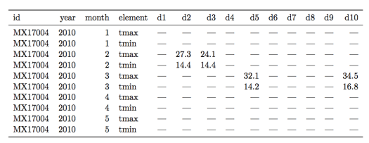
Let’s see an example of a messy weather dataset for a counterexample (data examples are from this paper by H. Wickham):

Figure 2.  A messy weather dataset.  Not all columns are shown for the sake of clarity.
Figure 2. A messy weather station dataset.  Not all columns are shown for the sake of clarity.

There are multiple “messy” data problems with this table.  First, identifying variables like day of the month are stored in column headers (“d1”, “d2”, etc…), not in rows.  Second, there are a lot of missing values, complicating analysis and making it harder to read the table.  Third, the column “element” consists of variable names (“tmin” and “tmax”) violating rule 1 of tidy data.

How to use R tools to transform this table into tidy form is beyond the scope of this post, so I will just show the tidy version of this dataset in Figure 3.

Screen shot 2014-08-01 at 1.55.23 PM
Figure 3. The weather station data in tidy form.

Each column now forms a unique variable.  The date information has been condensed into a more compact form and each row contains the measurements for only one day.  The two variables in the “element” column are now forming their own columns, “tmax” and “tmin.”  With the data in this form it is far easier to prepare plots, aggregate the data, and perform statistical analysis.


Five Common Problems with Messy Data

6957593947_75f7aaecd0_zReal world datasets are often quite messy and not well-organized for available data analysis tools.  The data scientist’s job often begins with whipping these messy datasets into shape for analysis.

Listed below are five of the most common problems with messy datasets, according to an excellent paper on “tidy data” by Hadley Wickham:

1) Column headers are variables, not variable names

Tabular data falls into this type, where columns are variables themselves.  For example,  a table with median income by percentile in columns and US states in rows. 

2) Multiple variables are stored in one column

An example here would be storing data in columns that combine two variables, like gender and age range.  Better to make two separate columns for gender and age range.

3) Variables are stored in both rows and columns

The most complex form of messy data.   For example, a dataset in which measurements from a weather station are stored according to date and time, with the various measurment types (temp, pressure, etc…) in a column called “measurements”.  

4) Multiple types of observational units are stored in the same table

A dataset that combines multiple unrelated observations or facts into one table.   For example, a clinical trial dataset that includes both treatment outcomes and diet choices into one large table by patient and date. 

5) A single observational unit stored in multiple tables

Measurements recorded in different tables split up by person, location, or time.  For example, a separate table of an individual’s medical history for each year of their life. 

Isotopic labeling of proteins in non-bacterial expression systems

As therapeutic proteins gain importance alongside traditional small molecule drugs, there is increasing interest in using NMR methods to examine their structure, dynamics, and stability/aggregation in solution.

Modern heteronuclear NMR of proteins relies on isotopically-labeled samples containing NMR active nuclei in the peptide backbone, sidechains, or both.

Although isotopic-labeling of recombinant protein is typically carried out in E. Coli expression systems, many biotherapeutic proteins must be expressed in eukaryotic systems to insure proper folding and/or post-translational modifications.   In practice, this means overexpression in either yeast, insect or mammalian cells.

Increased interest in attaining labeled protein samples for analysis by NMR is leading to better commercial availability of isotopically-labeled expression media and improved vectors for overexpression in non-bacterial systems.

Comprehensive reviews of state-of-the-art protocols and procedures for expression of isotopically-labeled proteins in non-standard systems are available here: yeast, insect cells, and mammalian cells.